Our growing development team has been on hyperdrive recently. You’ve been asking for improvements, and our team has delivered to make blog writing easier.And we couldn’t be more proud and excited about it.We’re a company that builds every bit of our code in-house, from humble beginnings to today. So, to give props where they’re due: A HUGE thanks goes out to the stellar development team of Wade, Reid, and Max for their tireless efforts.
Thanks for All Your Feedback
For months, we’ve been listening to your feedback and rethinking the customer experience and what that should/could look like and function in the ongoing pursuit of making our customers’ blog writing lives easier.What follows here is the first of many improvements coming down the pipe in the coming months, so consider this just the beginning of the parade of enhancements from the BlogMutt camp. We look forward to showing you what we’ve been cooking up.Which brings us to our latest big announcement to you, our loyal, blog-loving customers — we’ve got a slick new interface for you to explore, play with, and help streamline the content creation process for you even more.
Login
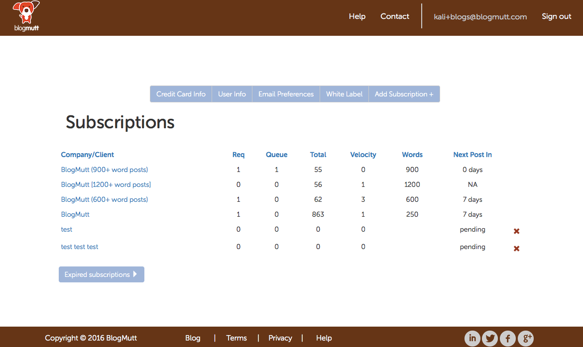
When you login, if you’ve got multiple subscriptions or are an agency, it’ll look largely the same:
It’s when you select an individual subscription that you begin to experience the new magic and ease of navigation that comes with the new interface:
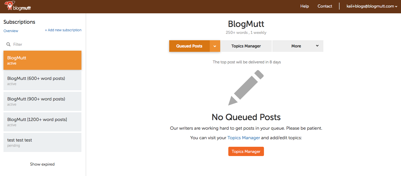
Voila! Here are some notable improvements:
1. Easily switch subscription views
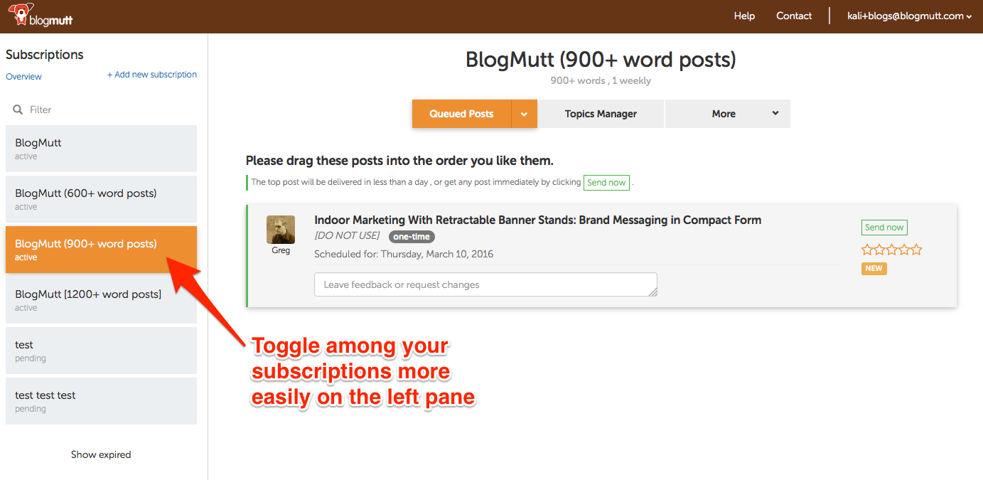
Whichever view you’re on will be the one that’s remembered when you switch subscriptions.
For example, if you’re in the Topics Manager for your 1200+ word subscription and switch to your 900+ word subscription, the interface will change subscriptions, but keep you in the Topics Manager. That way you can quickly update topics across multiple subscriptions with one click.
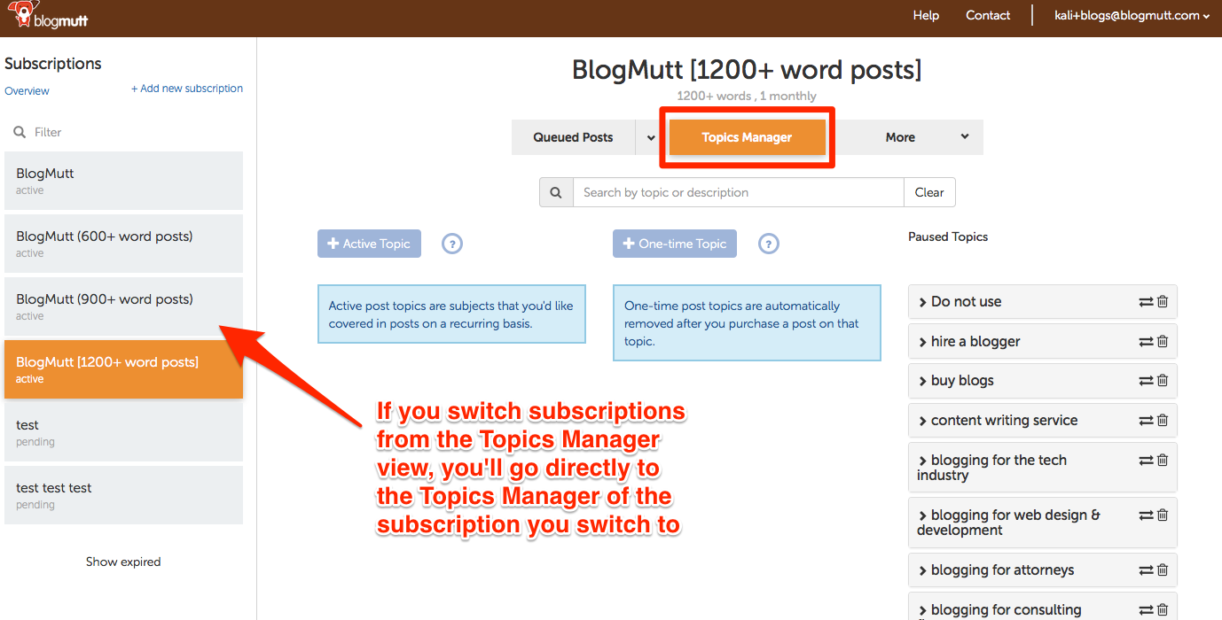
2. Filter subscriptions
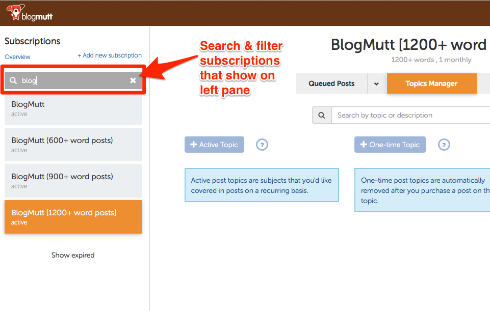
For those agencies with dozens and dozens of accounts and no way to sort them, this one’s for you. Filter the subscriptions to narrow your scope and prevent needless scrolling.
3. Faster load time
Pretty self-explanatory. You’ll have to experience it yourself to appreciate. 🙂
Now, let’s drill down into the changes on the individual subscription level:
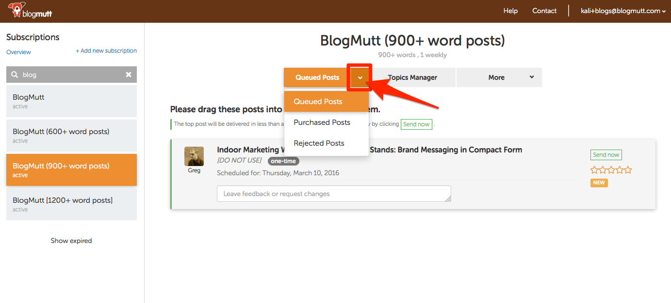
4. Access queue, purchased, and rejected posts from the little arrow icon
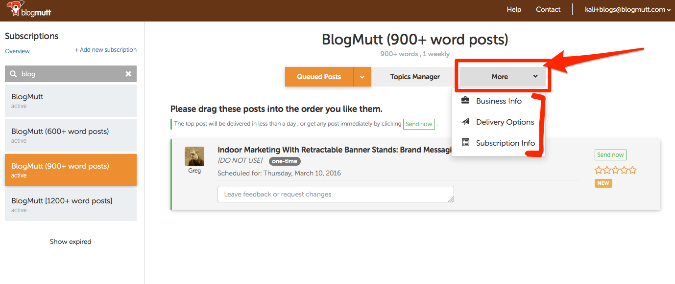
5. Make changes to subscription, delivery options, or business information from ‘More’ dropdown
6. Different look to posts
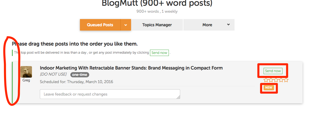
- The top post is now designated by the green line on the left. (circled)
- You don’t need to have a post ranked #1 in your queue to select “Send now” and claim early. Simply click the “Send now” button and we’ll send it.
- New posts will be notated with an orange-ish-colored ‘NEW’ box.
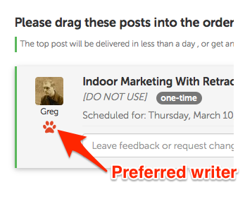
- Preferred writers now show up with a red pawprint. Because, obviously.
7. Start new subscriptions
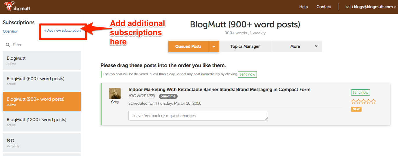
To setup additional subscriptions and get the 10% multiple subscriptions discount, click ‘+Add new subscription’ in the upper left-hand corner. A quick reminder, when you add a second subscription you get 10% off all your subscriptions with us.
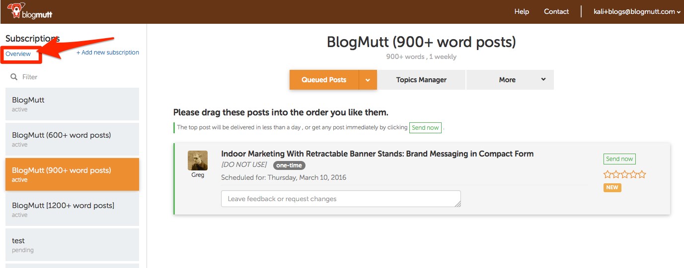
And, to get back to the main subscriptions page, select ‘Overview’ in the upper left-hand corner:
As you can see, it’s not such a drastic departure from where we’ve come, but we wanted to bring you up to speed on the new look the next time you login.
If you need help, check out the ‘Help’ link at the top of any of our pages to access the Help Center, or if you have any additional suggestions, we’d love to hear your input. Since we’re still tweaking the interface and making incremental improvements, feel free to shoot our support team an email at support[at]blogmutt.com with your feedback.
Or, if you’d like to walk through the improvements and bounce around questions with your fellow BlogMutt customers, we’d love to host you on one of our upcoming webinars (register below).


